Braspag
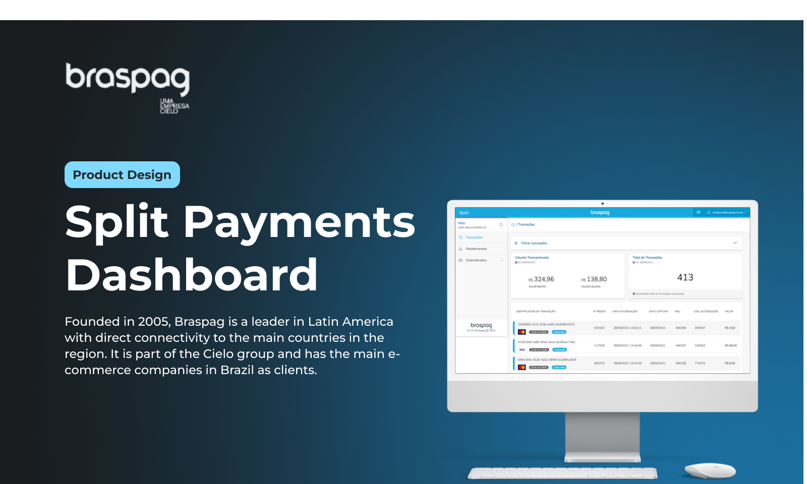
Founded in 2005, Braspag is a leader in Latin America with direct connectivity to the main countries in the region. It is part of the Cielo group and has the main e-commerce companies in Brazil as clients. As a pioneer in the means of payment sector, it enables its customers to convert more with the best solutions such as: gateway, reconciliation, anti-fraud, tokenisation, one-click purchasing, subscriptions, automatic payment splitting for marketplaces, franchises and physical shops.
Challenge
Create a financial reconciliation for a split payment product, giving the end customer a view of the money receivable.
Principles Goals
Delivery a good experience in Slipt's dashboard.
Project Time
3 months
My role
Product Designer
Team Structure
1 Product Designer, 1 Tech Lead, 1 Full Stack Dev, 1 Product Owner
Understanding the problem
Clients were unable to correctly predict the financial amounts they were due to receive from braspag as a result of their transactions in the payment split product.
This problem was generalised by a law implemented by the central bank of Brazil in June 2021. Since the beginning of the law, the Payment Split screens were no longer reflecting the correct values to be received, and the product team decided to take this feature offline until Braspag was able to establish the information.
Clients were forced to contact the call center in order to obtain the correct spreadsheets, which caused immense frustration on the part of the clients and a huge effort and loss for Braspag.

Design Requeriments
As the only designer on the project, my process was:
- Understanding the flow of the Receivables Units
- Map the relevant information in each flow - Agenda and Receivable Units
- Make a competitive analysis of other companies and how they are interpreting the values of the new law.
- Design and validate wireframes
- Design and validate UI - following already existing Design System
- Create a navigable prototype for user testing
- Invite, manage and conduct user tests
- Analyse tests and iterate flows
Competitive Analysis
PagSeguro
Analysis of the screens and flows of the receivables extract and financial calendar in October 2021 .
The analysis showed that some of Pagseguro's pages have been rebranded and others have not, which makes navigation awkward for the users as there is no consistency between the screens. In view of this design dichotomy, we preferred to keep the Split project in the existing design system.
Pagar.me
Analysing the portal's screens and flows with an emphasis on the financial agenda.
The user flow in the pagar.me product is very easy and intuitive, the design is user-friendly and the information architecture helps the user to navigate the various screens with ease.
MVP
To start creating the MVP, we began with prioritisation and discovery dynamics with the team. At this stage we decided what information was crucial to the success of the project.
After this phase, I started the first wireframes in figma, with the aim of visually supporting the team in the decisions we were making.
- Prioritise the improvement of usability within the portal following Nielsen's heuristics
- Use the legacy design, since the split code is antifo and new code could break the screens
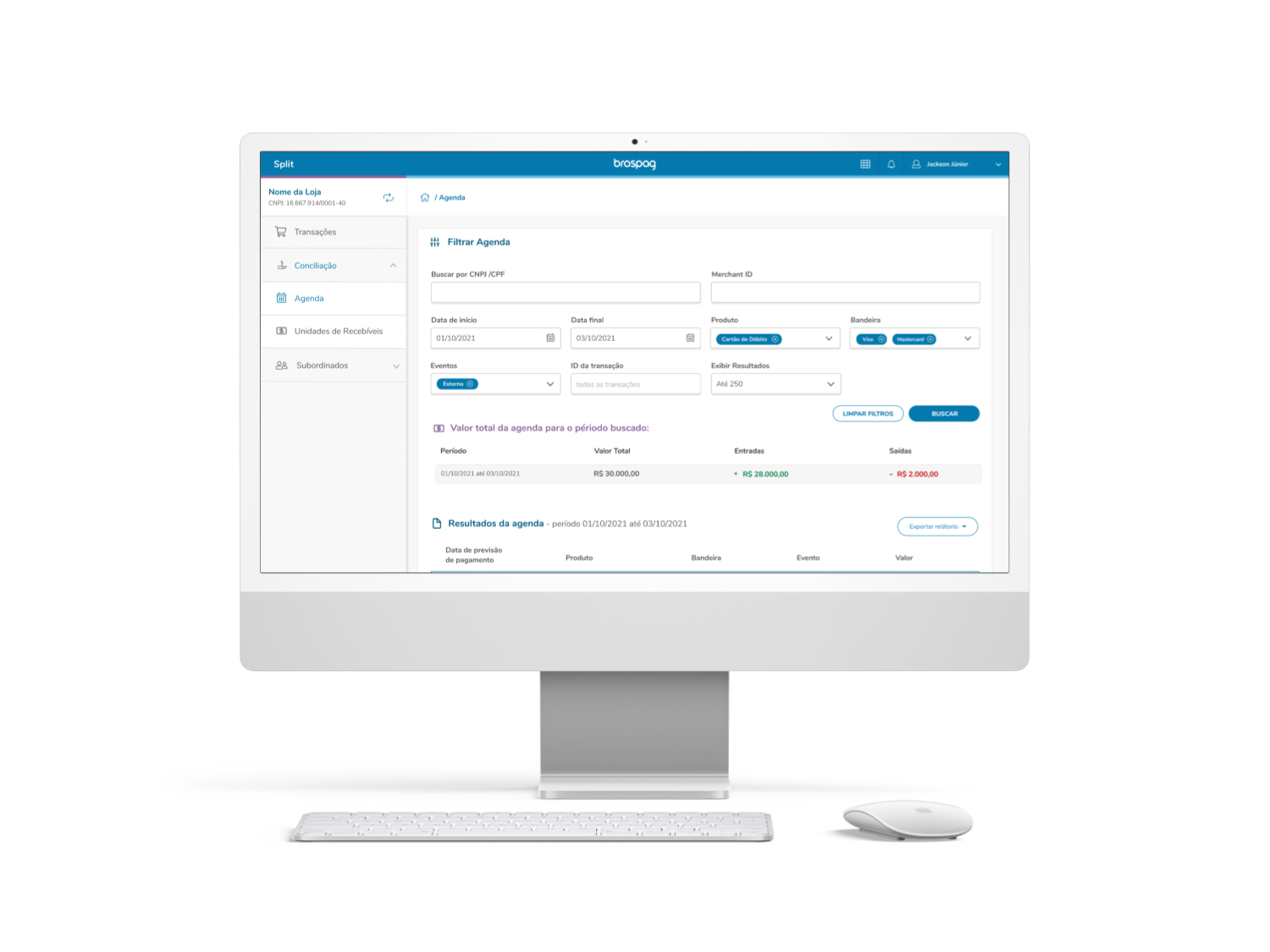
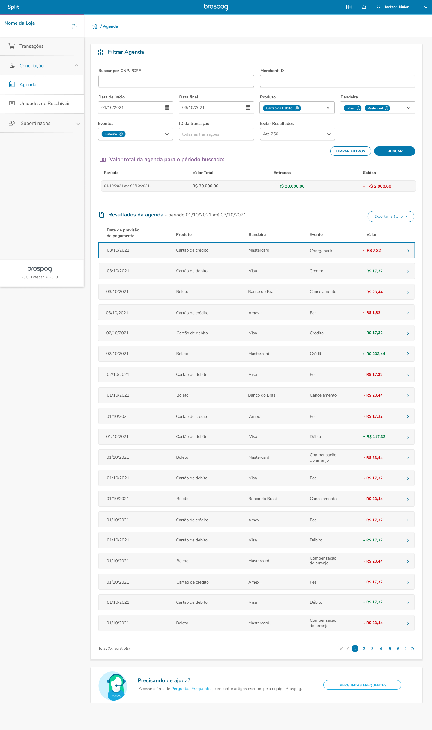
- Focus on giving customers back their autonomy through filters and the possibility of downloading reports online
- Allowing customers to resolve problems directly on the split portal without the need to call the call center
- Transparency in the information provided on screen
- I created 2 different journeys, one for the Agenda and another for the Receivables Units

User Tests
18
10
3
7
Companies invited
Demonstrate intersting
Invalidated tests
Sucessfull tests
All tests were conducted by me exclusively, with a duration of approximately 45 minutes via a meeting where the client received a link to the navigable prototypeer for the Receivables Units. The 7 tests were carried out with the heads of finance of the following large companies:
Melissa | Lojas M&M's | Biup | Stellantis Fiat | JCPM | Bonitour | Castor
Iteration Process
After testing with MVP, we have developed the dashboard further, adding new flows and iterating the pain points
Positive points by users
- Easy design and naming
- Direct report download from the online portal
- Compilation of financial income and outgoings by time period
- Configurable date filter
- Filter by company such as VIsa | Mastercard | Dinners
- Filter by event
- Link to view transaction details in agenda details
- Autonomy to configure the financial report
Points of improvement
- Customers did not understand the term ‘debit in balance’
- They would like a filter by transaction
- They would like the transaction to be in the foreground of the list shown
- More filters to be included: Recurring Payment, Transaction ID
- Possibility of extracting the financial report and receiving it by email
Final Version

That is all!
I would be happy to give you more details in a controlled meeting environment. If you would like to know more, please contact me.